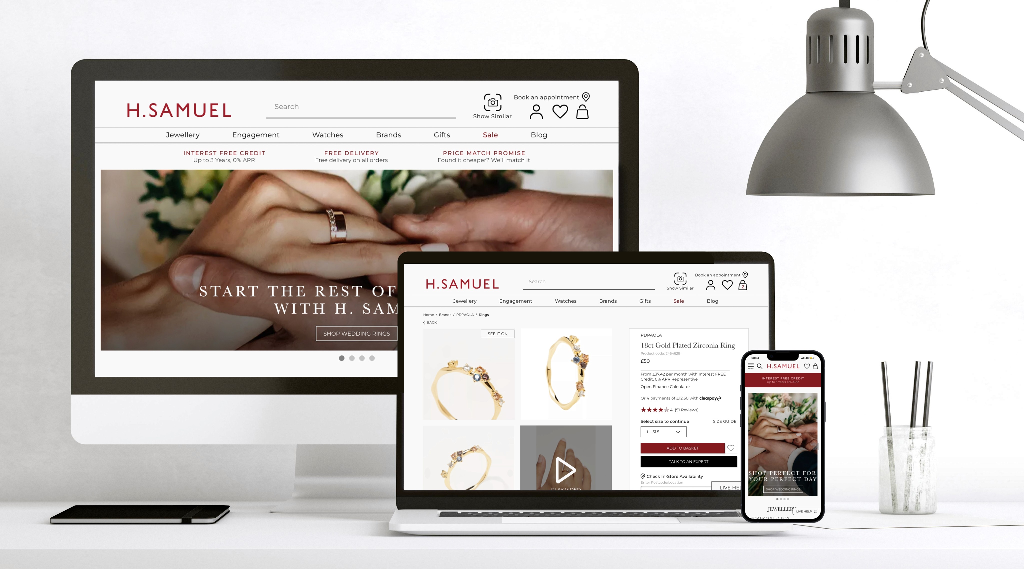
H. Samuel Redesign
Re-designing H.Samuel website using UX research to address user pain points and improve the user journey from homepage to checkout.
Brief: To identify problem areas within the user journey, find solutions and create a responsive design incorporating these solutions.
Project duration
2 weeks
My role
UX/UI designer and UX researcher.
Design tools
Figma, FigJam, Invision Freehand, pen and paper.
Background
Online shopping, also referred to as e-commerce, continues to evolve and grow, especially aided by COVID-19 restrictions. This also applies to the jewellery industry.
Although there was a slight dip in jewellery sales in 2020 (thought to be the result of delayed engagements and weddings), this rebounded quickly with the easing of lockdowns. Therefore, the online presence of a retailer, the usability and aesthetic appeal of their site plays a vital role in their success.
H. Samuel, a household name with a rich history, can be found on most British highstreets. However, although they have an online store, their online presence may be lacking. I will be redesigning the website by identifying user pain points and solving problem areas within the user journey to create a seamless and memorable experience.
The goal
To meet expected KPI’s -
1. Increase in sales
2. Less enquiries for the contact centre
3. Encourage referrals to friends and family members
To present the following deliverables -
1. 3 pages: home page and 2 other pages of your choosing
2. Mobile and Desktop compatible screens (Responsive)
3. A written case study explaining the processes and outcome.
The problem
H. Samuel’s current website design is “outdated”, lacking aesthetic appeal and violating several UX and UI laws - all points that I will discuss further.
I believe that by addressing the pain points experienced by users and designing to solve these problems, I will substantially improve the user journey and in turn, increase user satisfaction and conversion rates.
One user argued “it feels like I'm buying jewellery on a budget, for the prices I would expect a premium looking website and experience”
My design process

Research
Identifying the issues
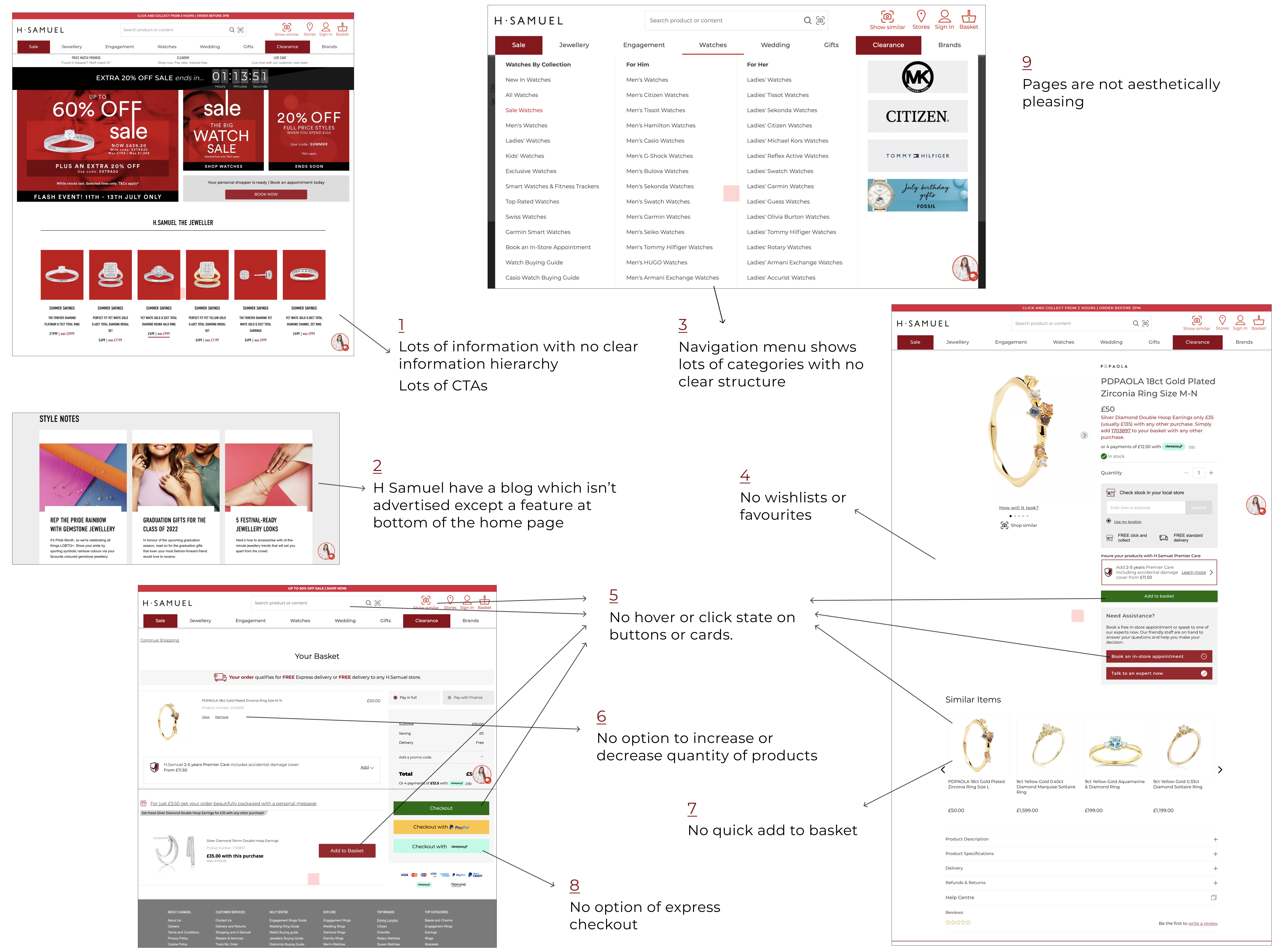
I began my research by conducting a website analysis on the home page, the navigation menu, a product page, and the checkout page of the H. Samuel website.The website analysis revealed the following problem areas with the H. Samuel desktop website -
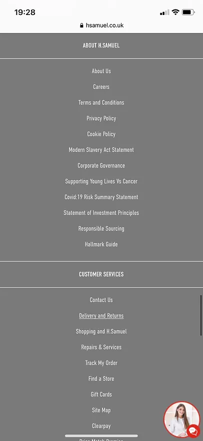
On the mobile site I identified the following problems
Endless seeming scroll for users with on the home page with the footer at the bottom, making it longer to reach.
The footer is presented as a long list - users must scroll through each section and it's categories to find what they are looking for, which can create frustrations especially for a user in a rush wanting to find important categories such as 'contact us' and 'delivery and returns'.
All points outlined above defy laws such as Miller's law, Jakob's law of familiarity, the aesthetic usability law and Hick's law, all of which would leave the user feeling frustrated and confused.


Competitor analysis
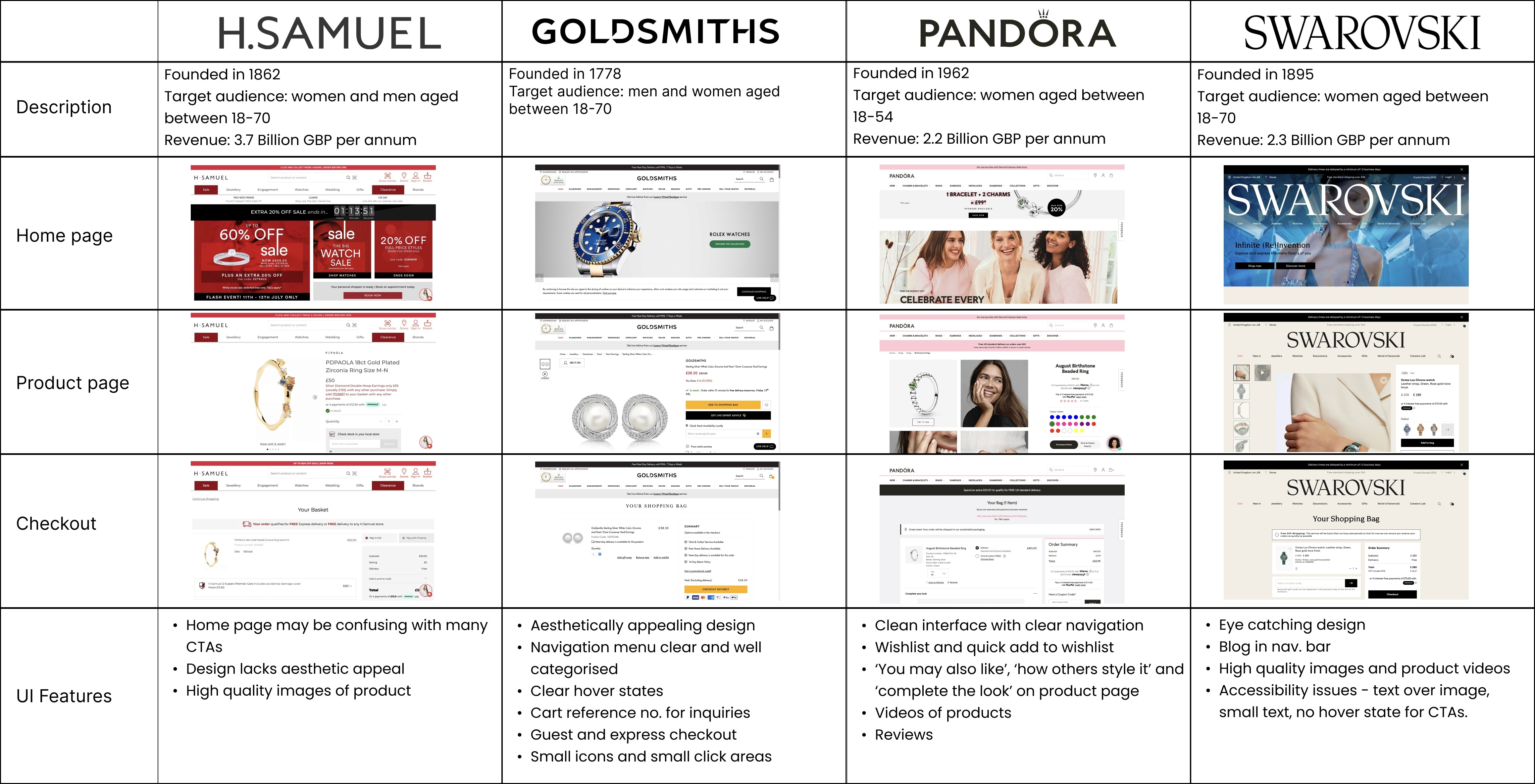
Next, I identified some of the direct competitors of H. Samuels - Goldsmiths, F. Hinds and Swarovski, all also fine jewellery retailers. This will allow me to identify features and analyse each competitor’s website based on design and UI fundamentals which I can use to make more informed design decisions to improve the H. Samuel website
User research
The next stage of my design process was user research, this stage allows me to gain in-depth insight on the preferences and expectations of users and identify any pain points they may have.
Surveys were carried out to understand how users perceive the H. Samuel website, its’ usability and how much they value the appearance of a site when shopping. I minimised bias by avoiding any misleading questions or intentional guidance.
Participants= 17 (12 Female, 5 Male). Ages 21 – 38 (Mean=24)
Findings
Users were also asked open questions to identify users' opinions towards the H. Samuel site, features users generally value in a site and how competitors' sites compare with H. Samuel's in their opinion.
Ideation

1. Almost all users were disappointed with the layout and design of the website, both mobile and desktop, labelling it “messy”, “overwhelming” and “outdated”.
One user said “It makes me feel discouraged and reluctant to browse on their website because there are a lot of options you need to click through to get to the products and makes the process of shopping on their website seem longer”.
2. Users emphasised the importance of wishlists when making their purchasing decisions and argued that with the ability to save a product for later, they are more likely to revisit a site.
3. Users argued that the option to receive an email when an item is back in stock is a feature they value and are more likely to revisit a site.
4. Users also pointed out that the product page is confusing and hard to navigate – with more emphasis on the click and collect option than add to basket. Users argued that because of the frustrations caused by this they are likely to just leave the site.
5. Users pointed out that with videos of products they would feel more confident in their purchase and are more likely to buy a product. They found it frustrating that even the higher priced products on the H. Samuel website didn’t have videos.
6. Users pointed out that the virtual assistant can be distracting and stated that an option to minimise or close that would be useful.
7. Some users revealed that navigation menu can be confusing as it’s too wordy and unstructured, and argued that categories could be sorted in a more efficient way.
8. Users argued that express checkout feature is something they value in a site, especially if they’re busy and don’t have time to go through a lengthy checkout process.
User personas
Card sorting
With 6 other UX designers, I did a card sorting exercise to identify the way they could be sorted that would make most sense to a user. First, we grouped the subcategories then labelled each group. Below is an example of how we sorted the watches category.


The current H. Samuel navigation bar could be a reason why users’ find navigation difficult - featuring overlapping categories such as ‘Sale’ and ‘Clearance’, and ‘Wedding’ as well as ‘Engagement’. Therefore, we redesigned the categories to make them clearer with less repetition. A category for ‘Blog’ was added to the navigation bar to showcase the H. Samuel blog more clearly than they currently do.
Mindmapping and crazy 8s
Mind mapping was used to outline the main elements and features I would like to include in my design based on my research and what is already on H. Samuel’s website.
Crazy eights sessions were used for three screens to map out the features outlined in the mindmap visually. This also gave me my low fidelity wireframes
Mid-fedility wireframes
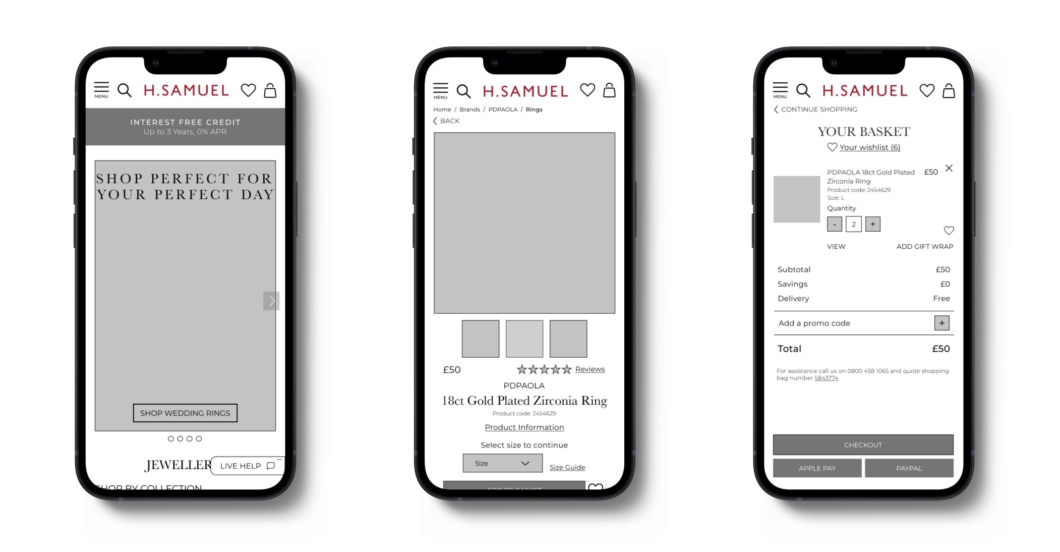
Using the mobile first method I designed my mid-fidelity wireframes

UI phase
Mobile
Desktop
Accessibility
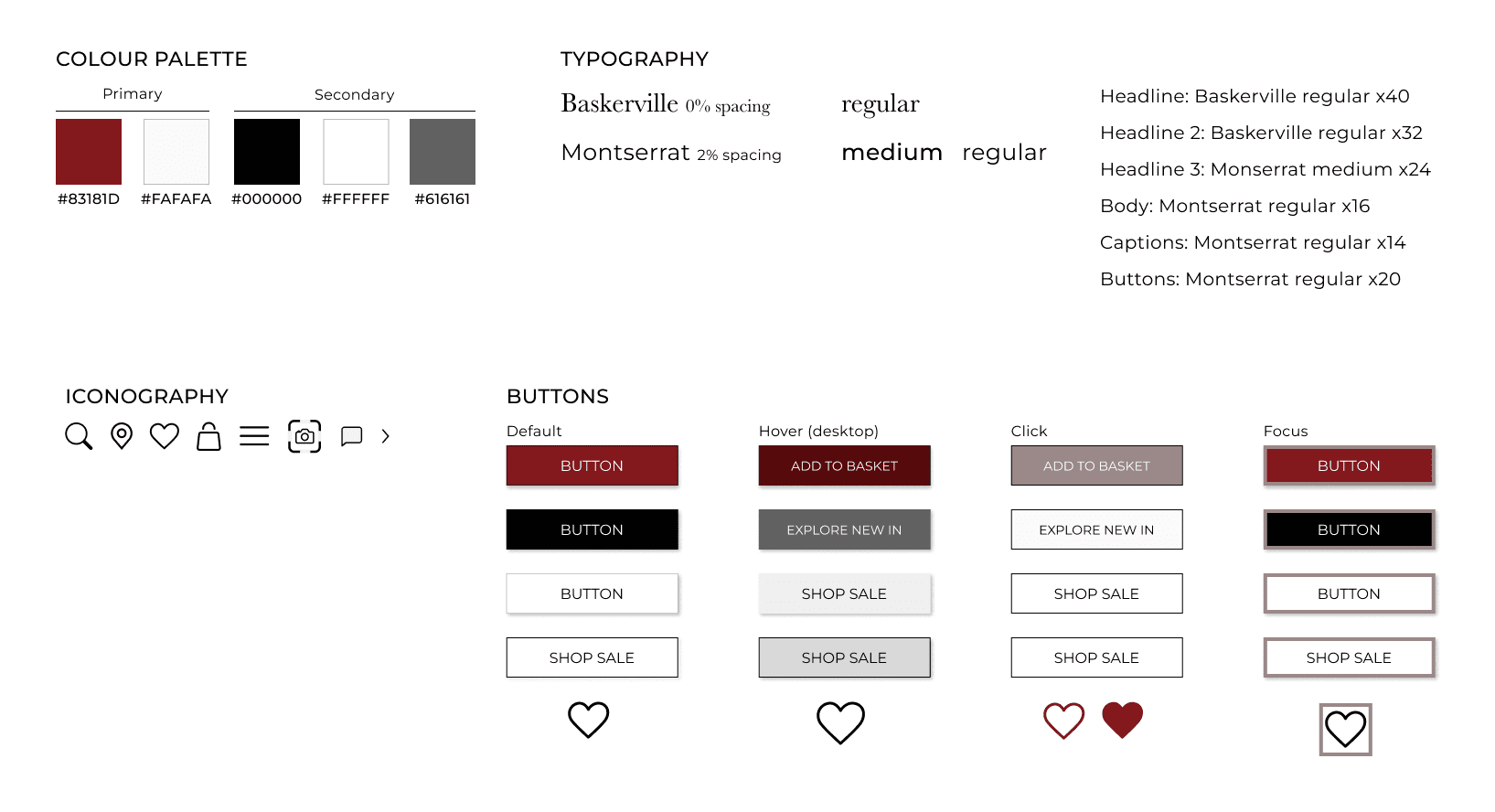
There are suitable colour contrasts in play, all combinations have been measured and match accessibility guidelines as much as possible. The text used is adequate and readable. All buttons have a default, hover, click and focus state. High resolution images and icons were used throughout the designs.
Style guide
Overview and Reflection
This design process allowed me to explore different design fundamentals and laws all while deepening my understanding of user research and truly delving into the design process. It also gave me the ability to develop my design and prototyping skills in Figma.
As I researched more into this case study, the more pain points I found, although the aim was to identify 5 issues, I ended up tackling a lot more. Although this meant that I could potentially improve the user journey substantially, this increased my workload and although I met the 2-week deadline and was able to deliver the final product, it proved to be a more stressful process.
This project taught me to not dwell too long and be too critical during one stage of the case study as you will be constantly making iterations and going back and forth to make improvements.
If I had more time, I would conduct user research to test my hypothesis that the changes made will in fact improve the user journey and result in user satisfaction to ensure that the changes made met the users’ needs and align with the business’ sales goals and growth.
Mahvish Munawar's portfolio.


